2036 Summer Olympics in Jakarta
Overview
The summer olympics bring together 206 nations to a selected country. This project showcases the 2036 summer olympics brand implementation in Jakarta. According to my research, Jakarta is known for its heavy traffic and culture diversity, having 450 languages and over 300 ethnic groups. To represent the city I went back to the city origins where I found an ancient tradition that has been practiced for generations in the Jakarta culture.
Ritual
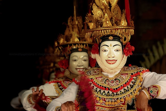
Topeng Telek is a dance ritual representing the guardians of the temples where dancers use masks with eyes staring back at you and bright lively colors that speak to the culture's spirits. My design represents the city of Jakarta by speaking to its people with a symbol they can familiarize with and the energy of their lively city.
Before topeng telek I had many ideas of how to represent the city, for example, focusing on the fact that many people call it the city that doesn't sleep. Jakarta is constantly moving since it is the home of one of the largest shopping centers in the world. However, after many sketched and more research I realized Topeng Telek was the core of the city for generations. 
Because Topeng Telek is such a known ritual in this city, the symbol I chose to represent its people are the eyes of the guardians as the main attraction of the logo representing the culture's ritual.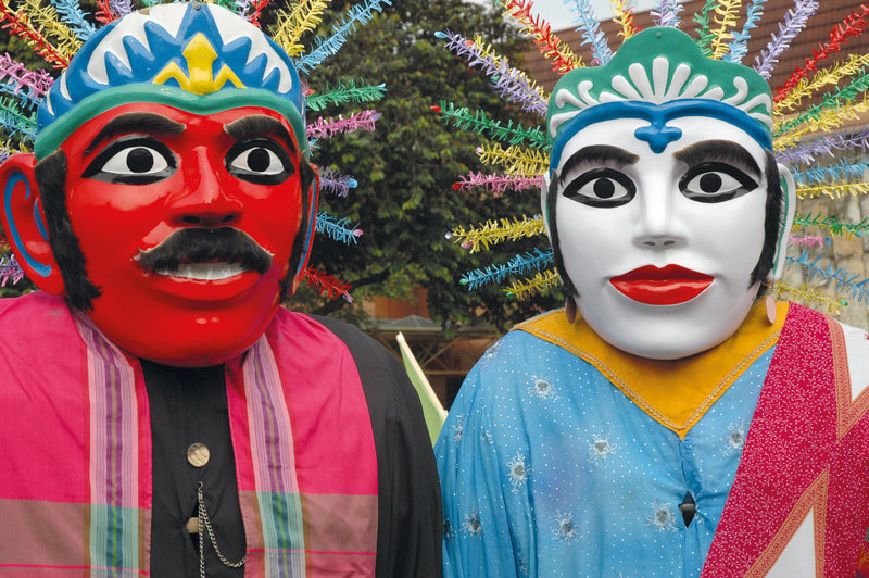
Logo
A thin typeface paired well with the icon, this allowed the typeface to stand well on its own without alluring too much attention from the main focus. I also customized the typeface to represent the structural city, almost like building blocks.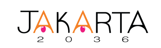
Colour Theory
The bright orange and magenta are the main colors throughout the piece. They not only signify energy and passion but are also the colors that are displayed the most throughout the temples in Jakarta. 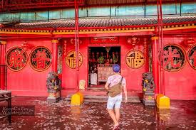
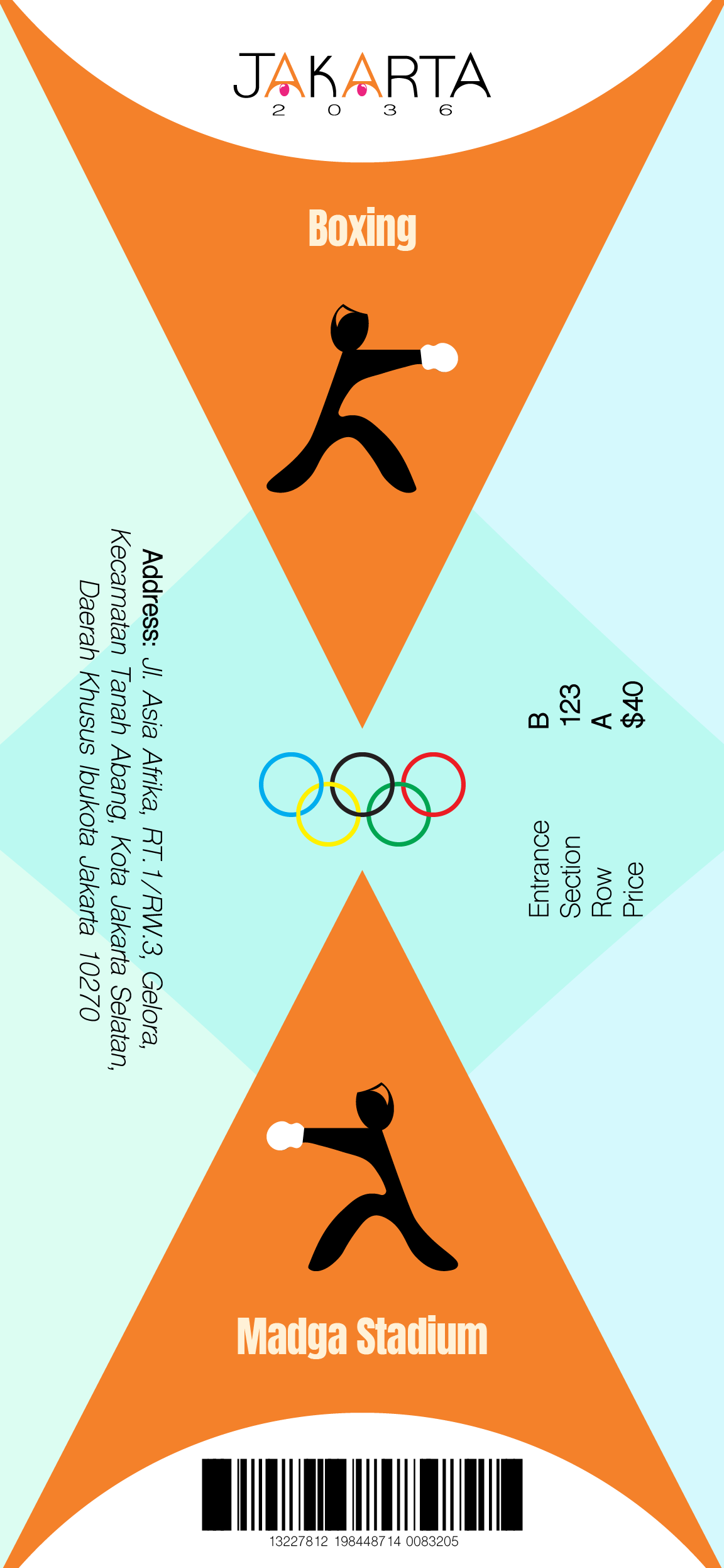
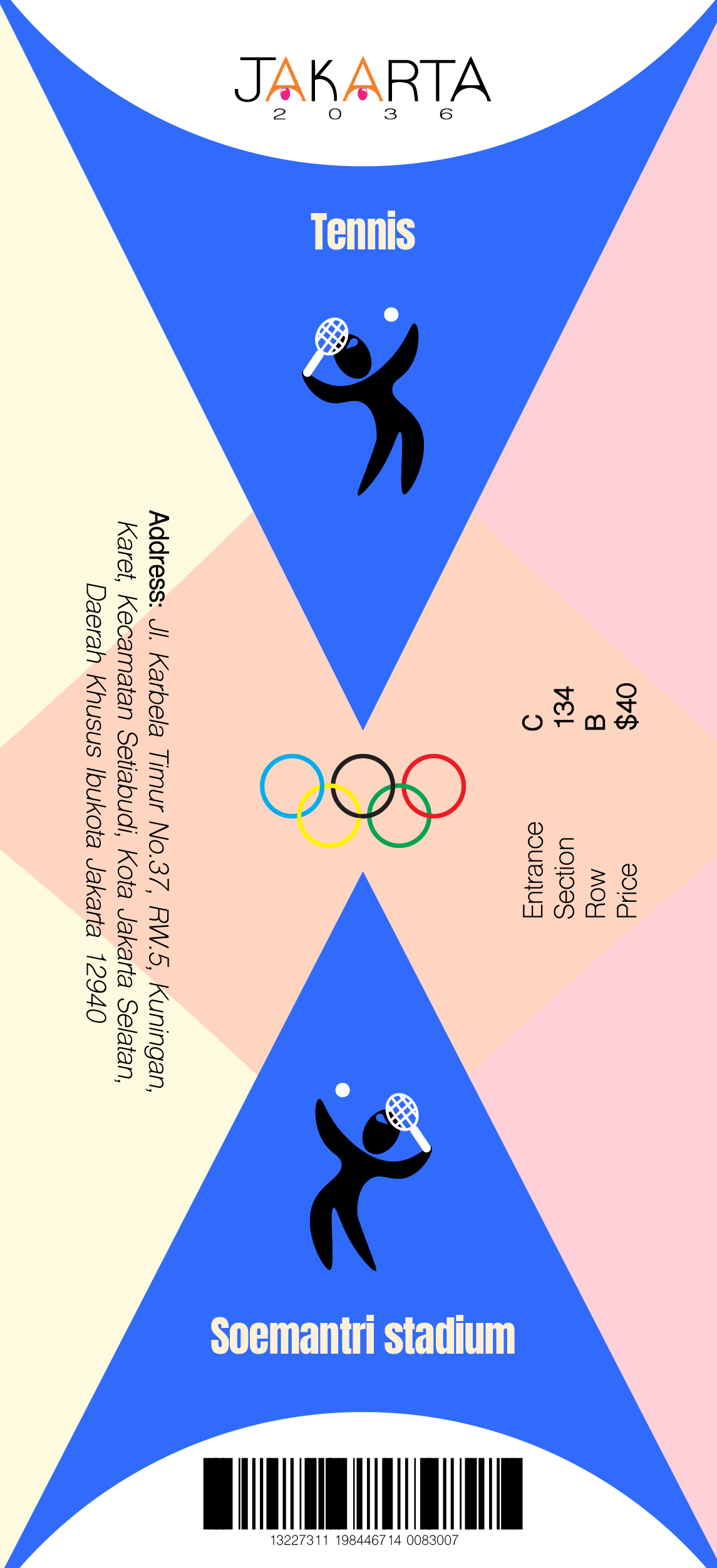
Olympic Sport Icons
Struggles
I wanted the icons to show energy and the excitement of being at the Olympic games. My original idea consisted of having the "A" of the logo reenacting the sport's movements, however, I quickly found that I needed more limbs to make sure each icon was clear.![]()
Success
Instead, I referenced back to the logo icon by keeping the eyeball as the athlete's head and giving it emotion through the eye's white reflection based on each sport. For example, the top of the head on the boxing icon has a down indent and an edgy white reflection, you can picture it as if the eye was angry and wants to use you as a punching bag. The fencing reflection is thinner and comes to a point as if it is focused on its opponent. The soccer reflection is wider and bigger, it shows a calmer tone since soccer does not have as much adrenaline as other sports do, there's more time to relax and walk around the field, and so on. ![]()
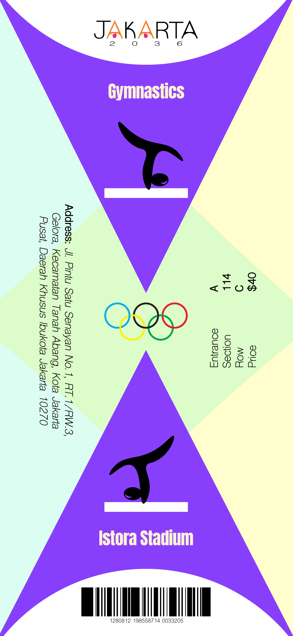
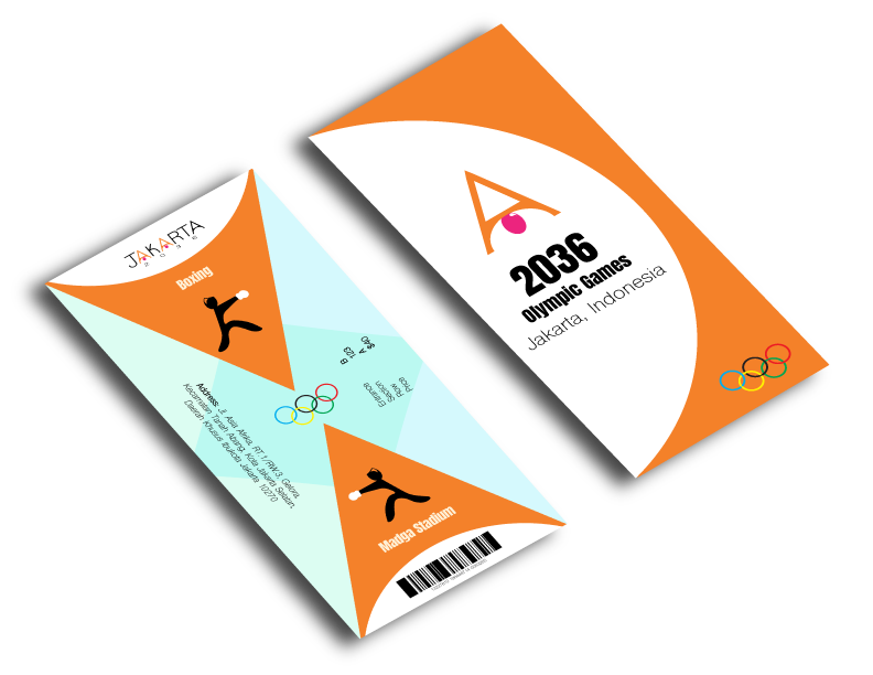
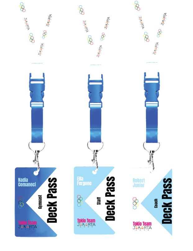
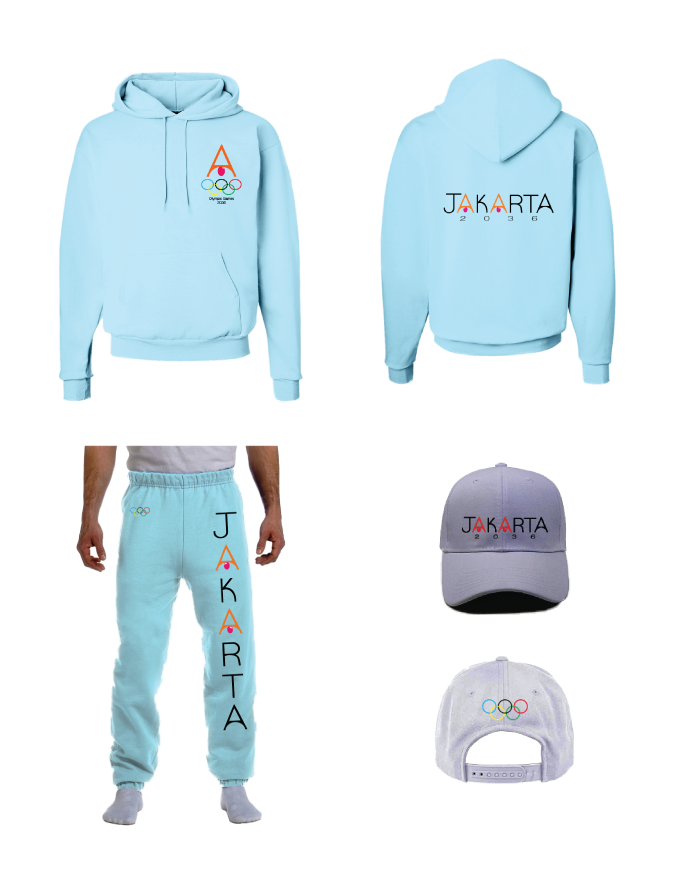
Final Product
Once the main logo and icons were in place, I used color and composition to connect the rest of the pieces to each other. The colors are a mixture of the city's festivals and lively environment to tie everything back to Jakarta.
Extra! Extra!!
The best thing about having your own customed brand is to have a place to showcase it, ← REMEMBER TO CHANGE THIS LINK where your clients can see your work and know how to reach you. Take a look at the website design on the link above.
If you would like your brand to represent you, let's talk and I will make sure your brand has an amazing design that shows who you really are. I can't wait to hear your story.