Sundance Film Festival
Overview
Sundance Film Festival is a yearly event that takes place every January in Park City, Utah. Film directors, designers, actors, business partners and even film aficionados get together to see the award winning films of the year.
Every year the Sundance Film Festival concept is re-designed for the event. This portfolio piece shows my concept on the 2023 Sundance Film Festival design.
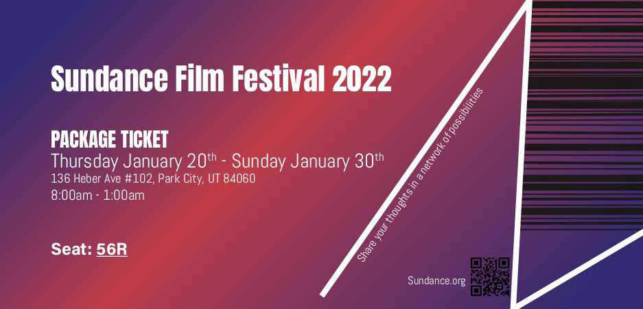
The concept I chose to portray is called "A Network of Possibilities." Whether you are attending as a nominee, a business man or simply as someone who loves films, this event is a massive networking web, which is the focus throughout the entire design "Connections."
Sketches
After many sketches, I decided to take a different route than most previous designs. Instead of focusing exclusively on the fact that this is a film event I wanted to incorporate the people and their emotions.
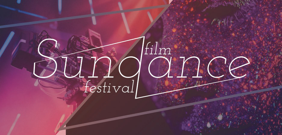
Logo
My logo connects the 2 distinct words in the main name from beginning to end. I chose a thin slightly slanted typeface to represent a moving web network of possibilities. The serifs and weight of the typeface shows a structural/ organized place but also in a different and fun way.
Color Scheme
During my research I discovered that previous festival's designs focused either on geographic elements, for example, many used cool tone colors because of the cold weather in January. Others focused on the word "Sundance" using warm tropical colors. I saw this as an opportunity to combine both aspects of this event. A dark purple gradient merging into a warm peach color not only combined the location and energy of this event but also gave it a melancholic and hopeful feeling showing expression, which is what makes a good film.
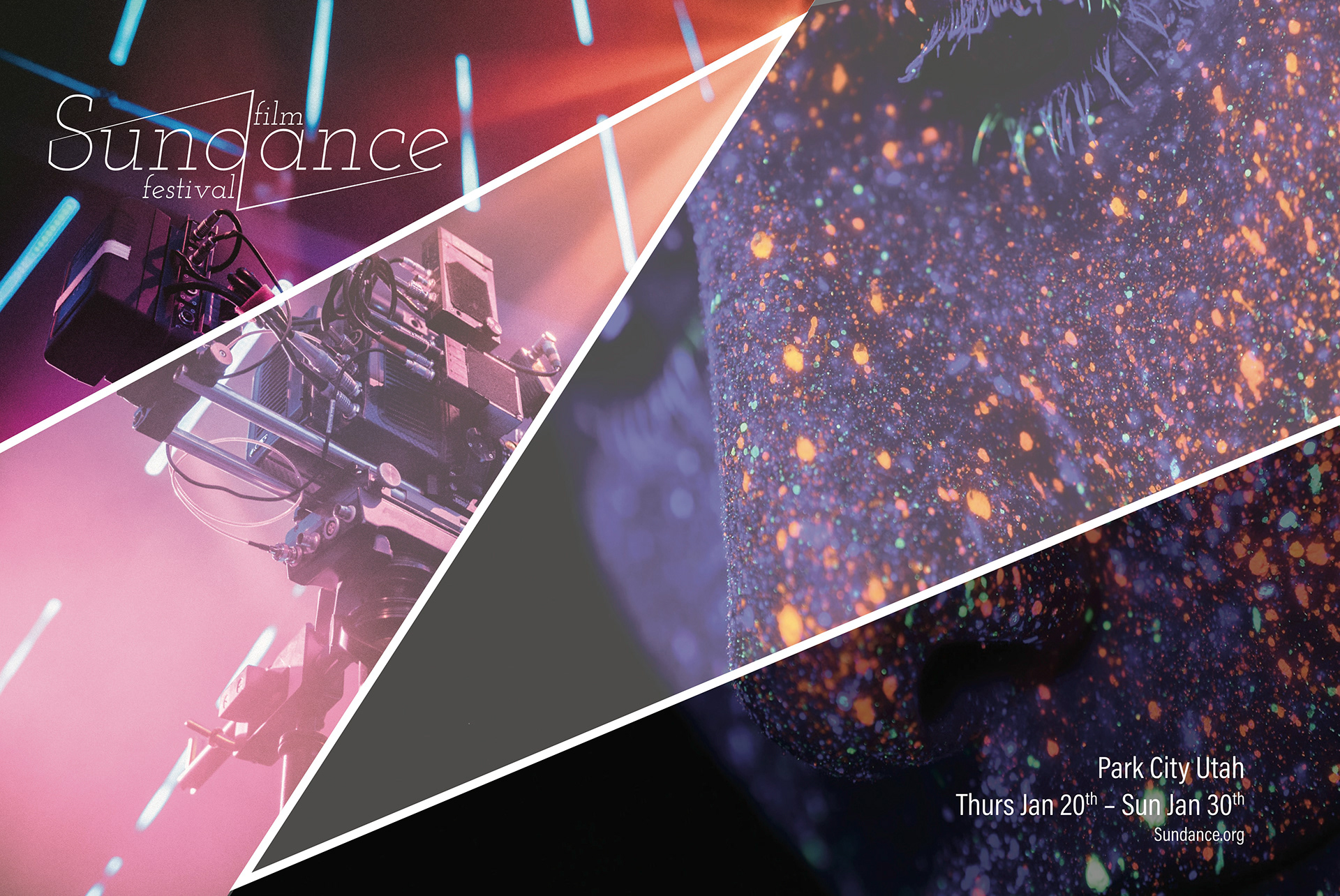
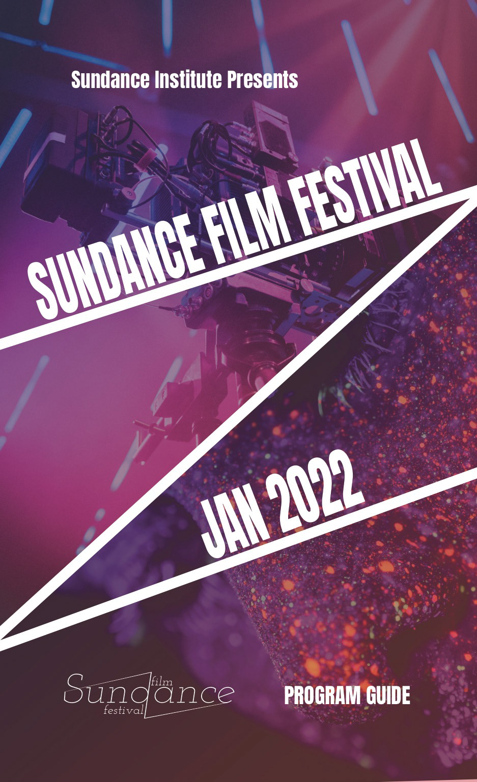
Poster
My goal was to create a dark, cool tone aspect while still feeling warm and exciting. Almost as the feeling one has, when recalling a distant but happy memory. Signifying a memorable invent that could potentially change your life. I achieve this by showcasing two different images working together through the use of color and composition. The image on the left signifies what the event is about "Films" while the image on the right represents a face conveying emotions.
Program Guide
For the program guide, "Drama" was a must. This piece also tells a story, not only about the films but also the competitors. Therefore, I decided to use a bold thick typeface usign Indesign to attract attention with contrast while still combining the main elements of the concept.
Front of Ticket
Back of Ticket